PRESENTATION AND DISCOVERY ON
AMAZON PRIME VIDEO
Project Overview
Amazon Prime Video has all the pieces of a great streaming service, but anecdotally and through usability testing I have seen that users are frustrated with the experience Amazon offers right up until they are watching something.
This project aimed to identify pain points and propose some solutions that may improve the users experience on the app, and make them more likely to choose Amazon Prime Video when other options are available.
My Role
UX Designer/UX Researcher
Goals
Test the assumption that there is a broader dissatisfaction with the Amazon Prime Video App on smart TVs.
Identify pain points in the process through research and testing any that users are in agreement about.
Prototype potential solutions to the identified issues.
Design Process
Double Diamond Design Framework
01. Discover
Gathering insights and exploring the problem.
02. Define
What is the core problem or opportunity and set clear goals for the design.
03. Develop
Prototyping, and testing iteratively to explore different possibilities.
04. Deliver
Finalising the solution, testing it, and delivering.
01. Discovery Stage
Research methodologies
The research carried out was primarily qualitative with quantitative research being carried out to support it.
Straw Poll
A handful of volunteers were asked to simply tell me their thoughts or feelings on the Amazon Prime Video App to simply gauge reaction to the application.
Alongside this various consumer review websites were consulted to gather a sense of the wider sentiment.
The intent behind both of these activities being to simply try to validate my assumptions that there is dissatisfaction with the application as it is.
Heuristic review
Reviewing both Amazon Prime Video and its competitors highlighted What has become industry standard, and where is Amazon at odds with that.
Something immediately evident was the density of information presented to the user
Usability testing
Users were observed as they navigated the application both casually and with a goal. Some of the things mentioned were:
Series are separated by season ie: separate thumbnails for season 1, season 2…
Films separated by version ie: Theatrical vs Director's Cut
Incorrect thumbnails
Incorrect version information
Inability to dismiss suggested content
Pushing content that's already been streamed
Too much scrolling
No back to top
See More option but no option to return to the last state/page
Region locked content
Data collection
Notes taken during interview and transcripts were processed and analysed for insights that may support my thesis with the assistance of Dovetail.
At this stage its evident that Amazon's User Interface differs from its competitors in ways that cause confusion.
In many ways they are simply shirking an industry standard.
Affinity mapping
Identified points of frustration most frequently called out.
Interaction Cost
“There are 4 thumbnails on screen but I can already see a third of the next thumbnail thats about to be presented to me. I know whats coming. So I have to click over twice to get a new piece of information.”
A concept that arose during the testing process is the idea of interaction cost. A number of users commented on how much they had to click around the page simply to get from one thing to the next.
The below excerpt is from a Nielson Group article examining this concept.
Why You Should Care About Interaction Cost
Interaction cost is a direct measure of usability. In fact, the concept was introduced back in the early days of human-computer interaction to evaluate the usability of a software system. All usability heuristics minimize the interaction cost for the user.
A quick assessment of the interaction cost of a design can save a lot of money in the long run, as it can give you a good measure of how difficult the interface is going to be for the user. It can also serve as a comparison tool between design alternatives: usually, the one that minimizes the interaction cost has a better chance of success.
This concept became very important to me in the rest of the design process. So often the complaint of users on streaming service is the idea that they are endlessly scrolling in search of something to watch. Lessening that feeling of have to ‘dig through’ the catalogue would go a long way towards user satisfaction.
Prioritisation
Through this prioritisation matrix I was able to bring focus to addressing features that would have the most benefit to the user.
The prioritisation matrix sorted the issues further:
Things that could be addressed through a UX design process now (Homepage Layout),
Things that could be roadmapped and addressed later (Signup Process),
Things that were feedback for the product in a wider sense but would be recommendations made to the business at a different level (Content curation and the accuracy of the associated data).
These priorities boiled down to:
Content Curation - what is in the catalogue, is it of sufficient quality either in its production or presentation to be there?
Content Presentation - How is the catalogue presented to users does it match the users expectations for browsing and discovery
Naviagtion - Where am I on the page, How do I get back?
Sign up/Login process - This was called out quite often and ultimately was not an area I chose to pursue but simply getting the application logged in on a smart tv caused some confusion. Most streaming services have similar processes but it seems Amazon is presenting the information around this process in a way that is tripping some users up.
Highlighted during this phase a was the fact that I would be designing for televison. This comes with its own specific set of requirements most importantly that the input device is a remote control.
Therefore directional pad (D-Pad) is primary navigation, with back, enter and home buttons.
02. Define Stage
Problem Definition
The user needs to understand their current position on the page, visibility of status.
They need to have the content aligned with a familiar mental model.
They need to have a clearer understanding of the layout of the application and how to navigate it.
Problem Statement
Users of Amazon Prime Video experience frustration in discovering content due to a categorisation system that does not align with their mental models for film and television. Additionally, the complexity of the sign-up process and initial landing page navigation contributes to a suboptimal user experience, resulting in increased barriers to engagement.
How might we enhance user satisfaction and facilitate content discoverability. There is a need to clarify navigation, re-categorise the presentation of films and television shows and to address the curation of content to improve the perceived value of the available library.
Personas
Personas were generated to represent two user types. Those that are not regular technology users and those that are. These two cater to the casual user who simply needs to get to a point where they can browse, search and play media and as such find the more technical aspects of setup a chore, as well as the user who can parse the various installation and troubleshooting processes put to them should they need.
If both these users are confused there is a problem if both these users are happy then we are getting somewhere.
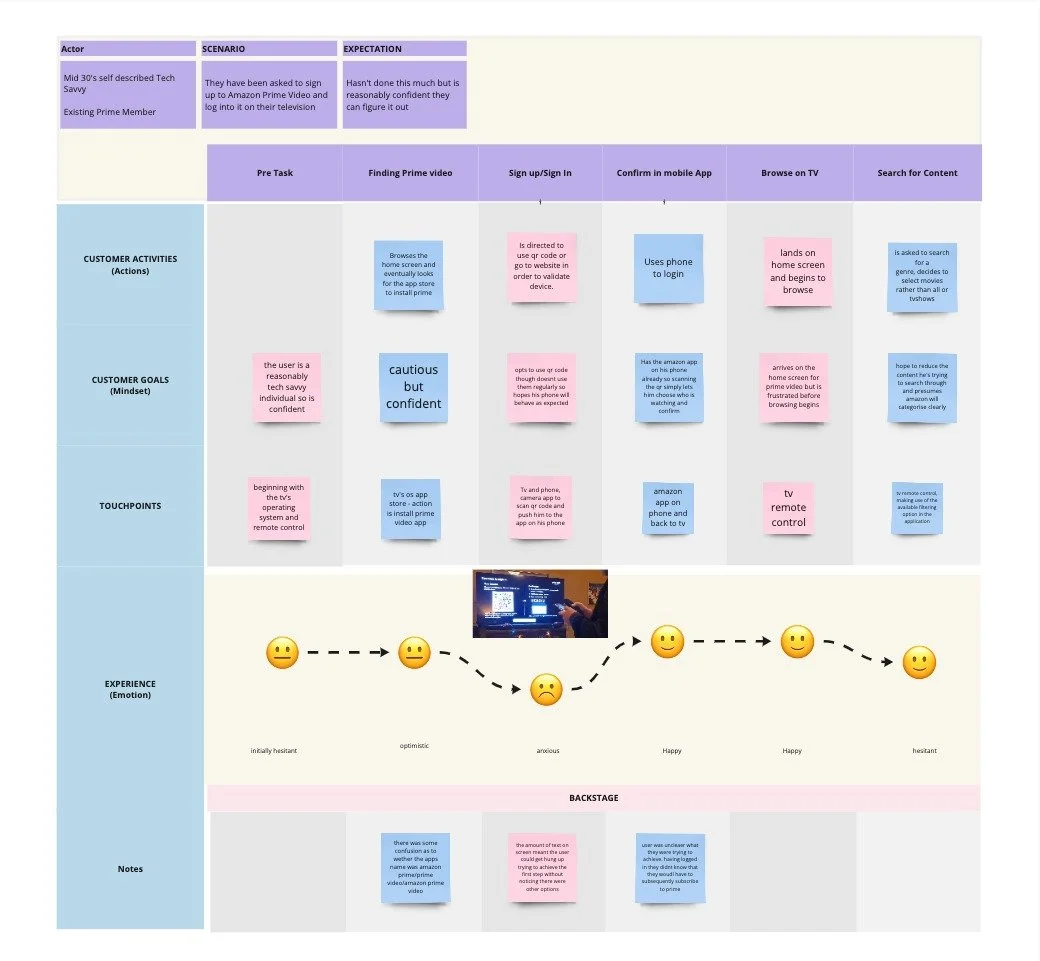
Customer Journeys
Using the above personas customer journeys were generated tracking the users from their first contact with the Prime Video app to the point that they begin watching something supporting the assumption at each step the user dissatisfaction.
03. Develop Stage
Idea Generation
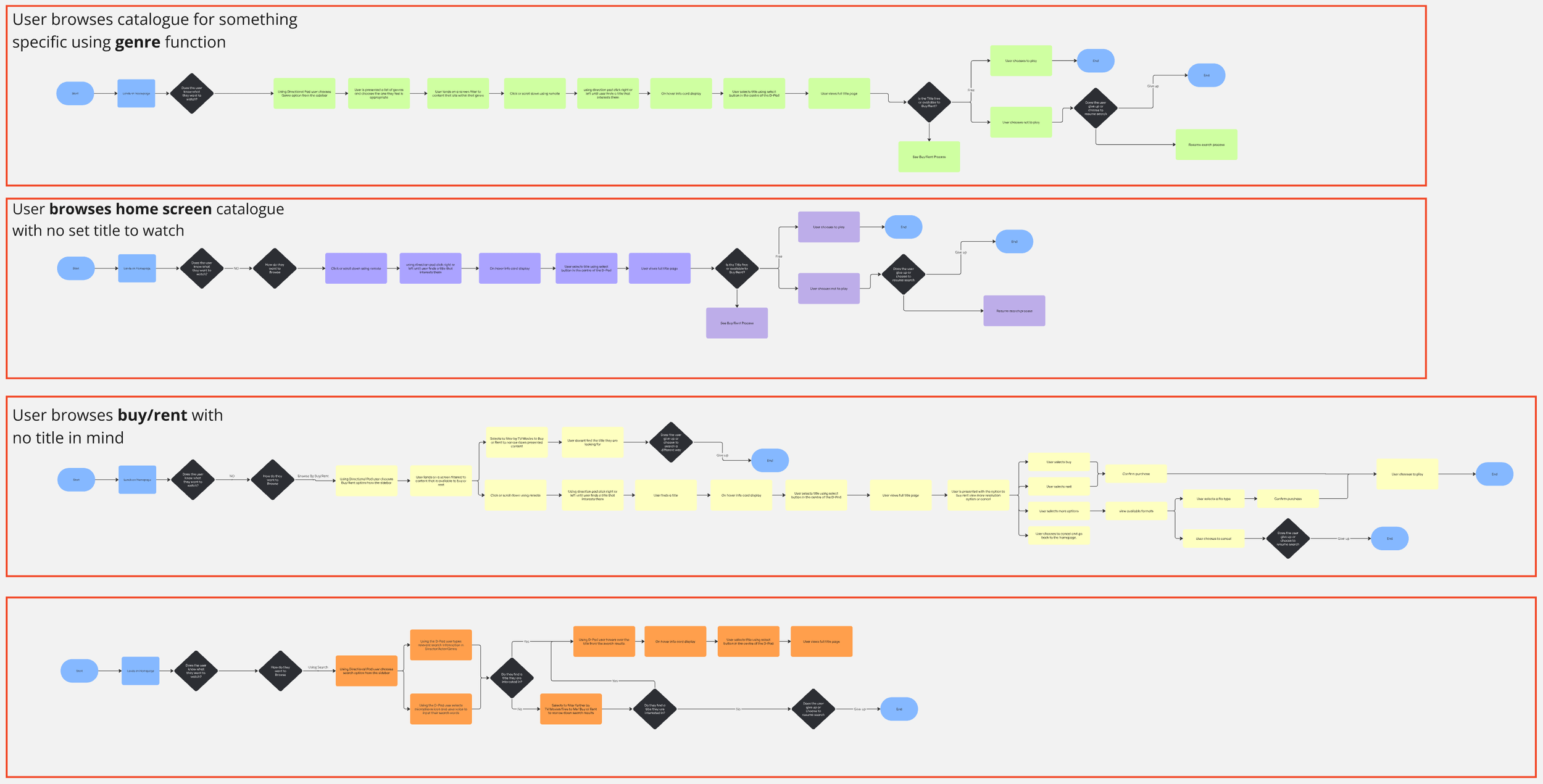
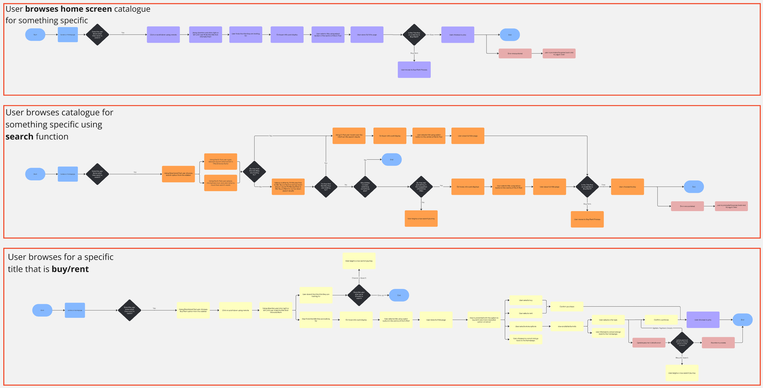
Ideation came out of the development of comprehensive user flows that I hoped to demonstrate.
It was also built on an exercise I had done early in the project where I documented all the rails of content presented to me:
Which were Promotional content?
Which were user generated?
Which were simple presentations of the catalogue in a genre language users recognise?
User Flows
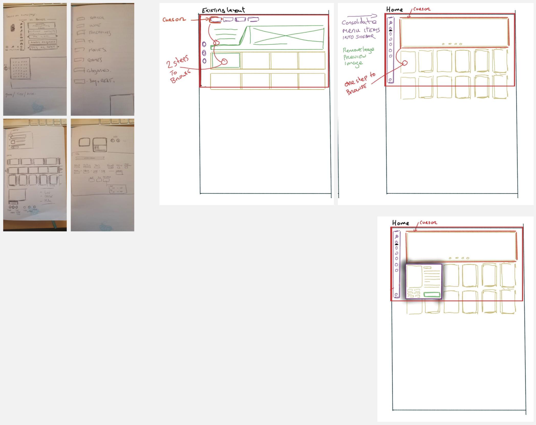
Concept Development
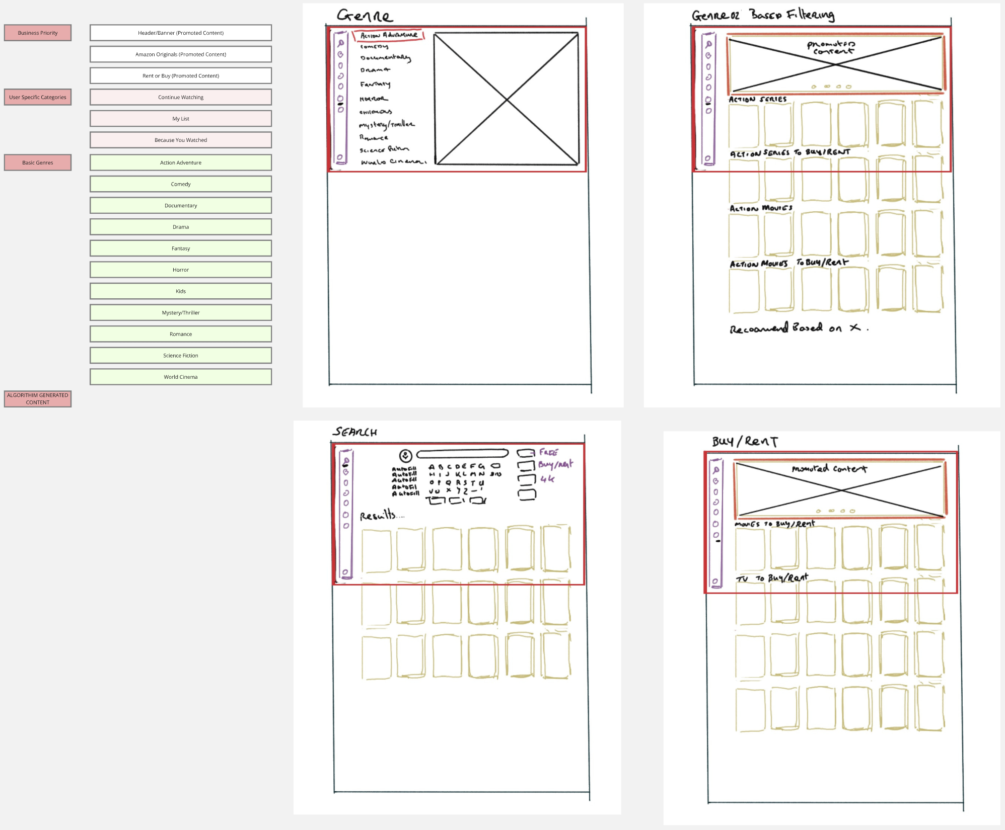
The key areas I sketched and addressed were the general layout, simplifying it to have less rails and less titles spread across a huge distance while at the same time presenting more usable information on screen at any given time. Next the sidebar was consolidated into one place rather than having some controls on the top of the screen and some on the side, this was all brought together in one place.
These two key features are addressed with the intent of making use of the application clearer and smoother for the users. Users are unlikely to run into content they cannot play.
They are going to have a clearer picture in mind as to where they are on the page at any given time and they are going to be able to more rapidly access tools to help them browse, navigate and search.
Design Reference
Below are some articles I found helpful during the begining of my design process.
Prototyping
Design Decisions
Order Of Presentation
I took the decision to begin with promoting Amazon Original and Buy/Rent content is as a result of trying to balance the business requirements with the users needs.
I removed the buy and rent content from the broader homepage so I’ve tried to ensure that there is original and rental content presented at the top of the page.
Genre Model
I then laid the page out alphabetically using the Genres that Amazon Prime had itself identified.
Localise Content
I added a world cinema category in an effort to simplify the content displayed across the homepage.
As much as a diverse range of international cinema being presented is a nice idea it was identified as distracting/ confusing/ irrelevant to a local user trying to find relevant content.
Simplify Search Input
I added the indication that users could search using voice input. As D-Pad text input was identified as a point of frustration.
Based on feed back during the course of the project I have given some thought to other solutions such as mobile device synced via QR code but that is beyond the scope of this project.
SIDEBAR
In line with my research I consolidated the menu options to one sidebar on screen left.
This brings Amazon Prime in line with industry norms and user expectations.
The final icon indicated the creation of a dedicated area for content that is Buy and Rent. This removes for the user the distraction/confusion of content that is not included in their subscription.
GENRE FILTERING
The genre selection was redesigned and was moved into the sidebar rather than keeping it in a submenu on top right of the screen.
Thumbnail Ratio
I opted for the 2x3 tile as it had been mentioned by a test user as “like being in a video store.” This real world analog appealed to me even if it may increasingly be a distant memory or completely alien concept to the youth of today. It also facilitates showing more available titles at a given time.
Iteration
User feedback during testing presented a handful of suggestions for iteration, each was worthy of further exploration in their own right but for the sake of the scope of this project though I implemented three best guess changes.
“More information would be nice could there be information when you hover over a thumbnail.”
“On the genre page the underlining of the Action/Adventure is misleading. It looks like an underlined heading.”
“How do I know what’s a film and whats a tv show on the home page”
Lessons Learned
Key Takeaways
Firstly prioritisation, when confronted with a number of opportunities being able to sort what is a high versus lowER priority.
There was also learning taken in the research required to understand the specific requirements when designing for a television as opposed to a Monitor, Tablet or Phone.
Challenges
This project had to take into account the needs of the business and the users which are at times at odds with one another.
The business needs to promote their original content and to push users to purchase or rent titles, the user wants to bypass anything advertising or upselling on a subscription they are already paying for.
Therefore the solution presented needed to try to understand why the existing application behaves as it does while finding a compromise that caters to both needs
This was done by meeting first the business needs and presenting users with the promoted and additional paid content, but removing paid content from the broader site and creating a dedicated section for it on its own using youtube's structure as an example of precedent.
Impact of the Project
This project insisted at every turn that I prioritise and focus. So many aspects of this application are intertwined with one another it would be very easy to try and address smaller problems as they present themselves.
Being able to navigate my way through these potential tangents has taught me to focus on the great good of the job at hand.
Next Steps
In the future, further research and design could be put into how Television and Film are separately identified within their respective consolidated genre categories as the final phase of usability testing identified some opportunities for improvement there.
There is an opportunity to look at alternative approaches to search. Amazon's integration with Alexa and voice responsive technologies seem to recommend itself here, as well as potentially an option to sync the users cell phone to the search process perhaps using a qr code. The secondary device is a more intuitive typing experience than the D-Pad on the remote control.


